Case Description
OpdagDanmark is a small startup in Aalborg developing tomorrow’s tourist information–an app that puts the best places to visit on a map and serves personalized information at the right time and at the right location. The app is still very basic in terms of features.
The team came up with possible ideas to increase the user experience while using the app based on some insights and data collection from potential users. We thought about offering a complete experience for the users in the app and focus not only on tourists but also offer some options for people living in the city. We also chose this idea as it offers a different concept of the ones in the market incrementing the customer`s value. With Trip Planner, users could have a complete plan based on their preferences and enjoy a day in the city.
Group 11 – Team Discovery
Emil Bisgaard Jepsen
Tatiana Henao Duque
Cecilie Johansen
Simon Gøgsig Egebak Jensen
Andreas Ottosen
Concept video
Trip Planner is a feature in Opdag Danmark`s app that aims to facilitate trip planning activities for users. In the app users can get a day plan in a city based on their preferences with little to no effort. They can enjoy a trip without worrying about activities to do in the city, places to get food, the “must see” attractions, etc.
This is the hand-in for the deliverable: 1 final video scenario.
The Design Process
Data collection
We have decided to use a mixture of qualitative and quantitative data collection. We will conduct multiple semi-structured walk-along interviews where we will ask the interviewees to walk us through their actions while navigating to various activities. Separately we will conduct an online survey where we ask the participants about their habits when it comes to vairus vacations and leisure practices. To further support our data we will research other similar services and how they integrate different features.
Affinity Diagram & Material Storytelling
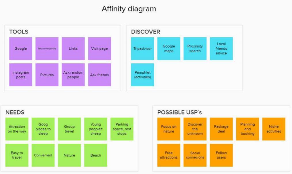
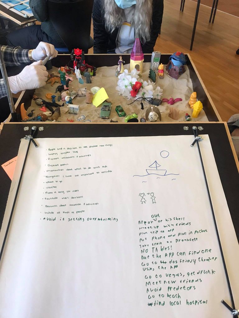
For analysing the data we collected we used a combination of Affinity Diagram and Material Storytelling.
For the Affinity Diagram we first manipulated our data in the physical space by using a whiteboard to visualise our data. We then grouped the relevant data to get an overview of the data.
For the Material Storytelling we gathered different artifacts in a sandbox and tried to use the data we gathered to tell a story of how we would invision different scenarios that could occur in use of the app.


Core Concepts
Trip Planner
A Feature where you can quickly plan a trip that lasts about a day or two. You are given a series of suggestions and options such as a timeframe, cost and activities, and then the feature plans out some trips/ideas for you that you can choose between and make reservations. A key feature of this is limiting the user’s options, as to prevent them from getting overwhelmed by options.
the core qualities of this design is Convenience, Discoverability, Simplification, and Customisation
Discover Mode
A feature that notifies you as you walk around about notable activities, locations or places near you, such as good places to eat, nice camping sites or historical locations. A key feature of this is that it allows the user to set the pace of the journey and that it showcases some more niche locations and events that sites like Google Maps or Trip Advisor might overlook.
the core qualities of this design is Dynamic, Exploration, Niche, and Inclusiveness
Community Journeys
A feature that places a heavy emphasis on community building. You can use a Meetup function to find travel partneres, and be able to chat with them through the app. It also includes a recommendation system, where people can recommend places they were personally fond of and follow other users, so that they see their recommendations and can follow their journeys. A key feature of this is that it builds a sense of community within the user base.
The core qualities of the design is Connecting people, Social, Community.
Summary of secound case partner meeting
After our second meeting with the case partner, we presented 3 core concepts for how we might approach the case. (Trip planner, Discover mode, Community journey)
The meeting with the case patterns didn’t focus on discussion about which idea was the best one or which one should the team pursued but they let the team decide which we thought would be the most interesting idea to further develop. The case partner named which part or features of each idea was attractive to them and how we might improve or refined them.
After the meeting, the team got a clearer idea of how the final design for the app might be. It was decided to focus on the first idea (The Trip planner) and if possible, involve some features of the other two ideas.
HMW
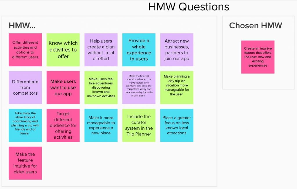
Through the How Might We method, we first form different HMW questions and from them created a final HMW question which we continued to work from.

Based on the HMW question we generated 8 different ideas and selecting the 5 best ideas. After this we Improved and refined the 5 ideas with 8 complementing ideas this was done to reach a local maxima within each idea. We then evaluated all of our ideas against our HMW question and selected our 3 favorit in hopes of finding our overall global maxima.
Sketches of the concept
Video Sketches


