Case : Opdag Danmark
Members of the team: Emil Kirkgaard Sehested, Cecilie Stubberup Højberg, Simon Peter E-tuporn Sørensen, Mette Raahauge Madsen, Thomas Ebert
Concept video
Final Concept
This video focuses on the users experience while travelling in a new city (or exploring ones own city). The concept, is that Peter, a student, wants to experience an area (we have used Aalborg as a base, but this idea could be implemented all over Denmark) and he uses a feature of the OD app, which is a quiz combined with a tour. Because of the quiz aspect, Peter is more actively engaged with the tour and he can win rewards, which could help spotlight local businesses such as cafe’s or museums.
Secondary ideas
In this stop motion video we are meeting Peter, who is a student in Aalborg, an the focus is about community and inspiration. The ‘inspiration’ is seeing where Peter is using the Opdag Danmark app for food inspiration, and the ‘community’ when he writes to other users in the area
Everything in one place
The concept of this sketch is offering a hub solution to gather information, while collaborating with other applications like rejseplaten or other transportation and restaurant services to give the user an all in one solution. The solution particularly addresses people who need a general guide and are not familiar with the travel destination. They shall be enabled get access to
The Design Process
Plan for empirical work
On the first day we met our case partner from Discover Denmark. We prepared questions for him about the app and especially its target group, content and form.
We have chosen to focus on the user and therefore we have brainstormed a list of end users such as tourists, danes, families and students. The list of end users helped us define our target group, which is students with the subgroup international students vs. danish students.
We have created a questionnaire focussing on the experiences our target group have with travelling in Denmark and exploring their local area. These questions have been chosen to help us figure out the best features to implement in the OpdagDanmark app.
Material Design
Here is our work from Material Design. It was fun but we still have alot of problems 🙂
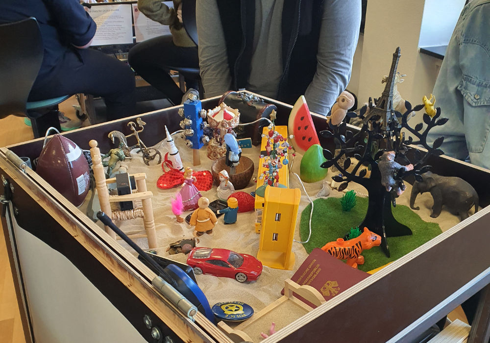
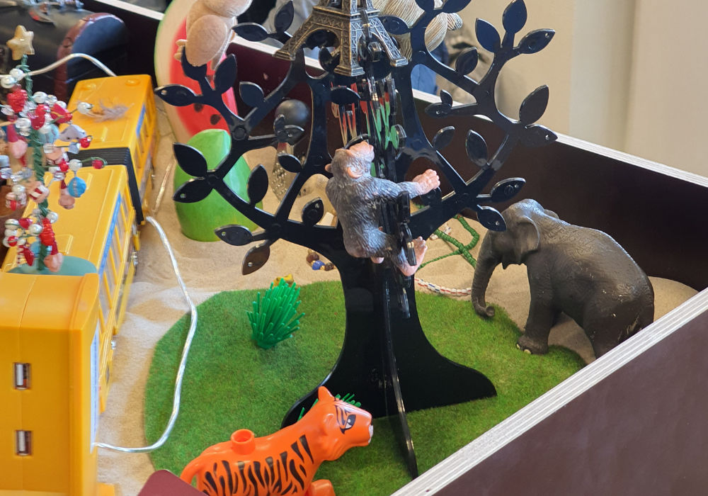
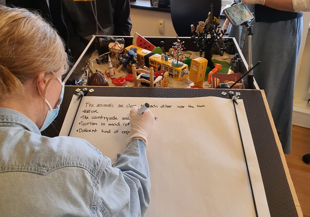
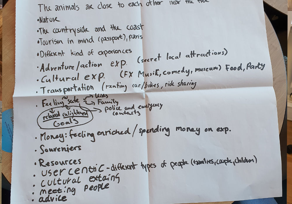
Core Design
After the meeting with Lau we’ve decided which core design to use, or rather further developed the models we made earlier. Along with Lau we have decided on a model focusing on the gamification of travelling.
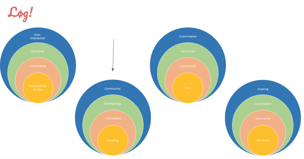
Final Core:
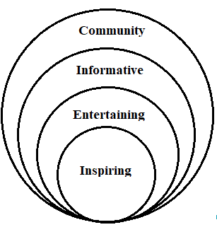
Summary for the website and Lau:
After the meeting with Lau we have changed a bit in our favourite onion, so now the ‘entertaining’ criteria is more near the core, which is ‘inspiring’. Lau was very open to our ideas, and he was especially excited about our thoughts about incorporating gamification into the Discover Denmark app. We also presented our target group ‘students’ to him, and with that group in mind we talked about the overall question: “How can the app engage young people, especially students?”. We were happy about Lau’s feedback and inputs to our project, and we are looking forward to showing him our design on Friday.
HMW :
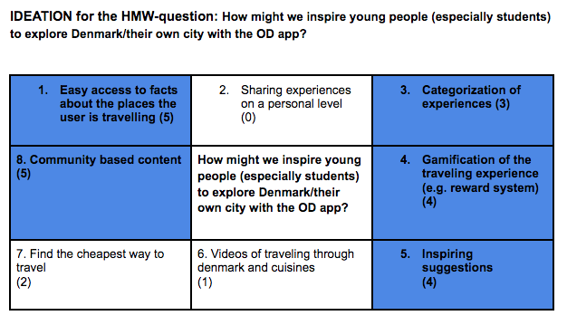
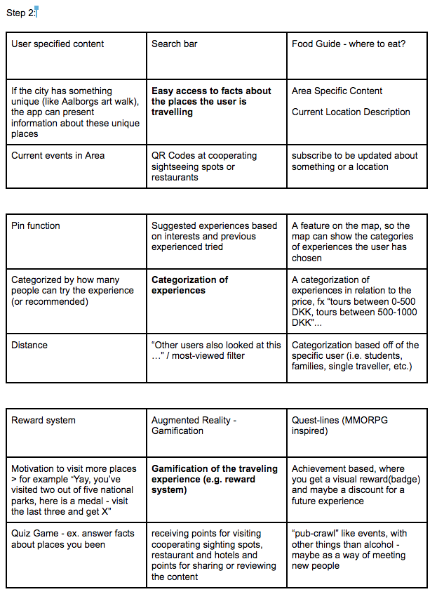
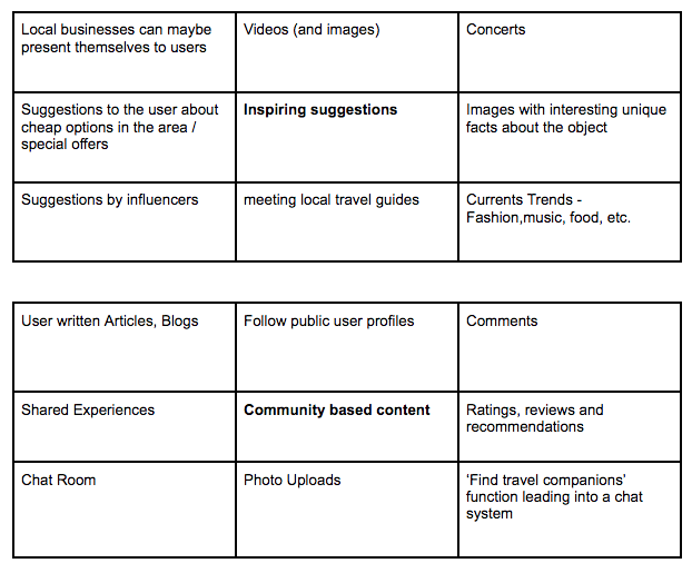
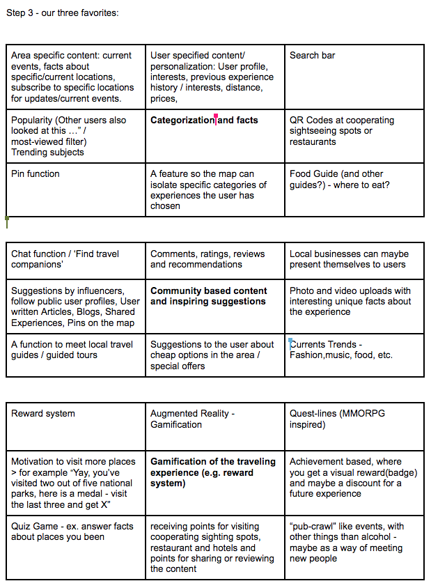
Sketches of the concept
Embed your initial video sketches from Youtube here, together with short (100 word-150) concept descriptions and how you visualized it for each one. This is the hand-in for the deliverable: 3-5 visualized concepts.

