Casepartner: Aalborg Slotsteater
Aalborg Slotsteater is a theater group who focuses on making theater modern and innovative. They are showing a play in August 2021, called “Tobakken”. This play revolves around the life of the Obel family, as well as the everyday life in the tobacco factory, once located in Aalborg. The play is going to be performed in the garden at the monastery, located right next to where the original tobacco factory was found, before it burned down and thereafter moved.
Our case is to make a connection between the theater play, and the ongoing exhibition at Aalborgs Historical Museum, also located in the same area, next to the monastery. As well as linking these together, we also have to keep in mind that this should function as a form of programme, providing information about the play.
After conversations with the case-partner, we chose to formulate an extra framework for us to work within. We chose that we would develop the concept so that it would focus on attracting a broader, as well as younger, age group to see the play, while making a solution that would tie the play and exhibition together.
Members of the team: Vladimir Erhan, Dennis Au, Amalie Maindal Nielsen, Sofie Grønvald Laustsen, Joachim Holmgård Bøgelund & Thea Bjerregaard.
Concept video
Our final concept video is based on the two video methods live drawing and stop motion. We utilized these two methods in order to showcase our final concept – an interactive mystery app, where YOU become the detective! The purpose of the app is to gather families around these fun and engaging activties while they learn more about Aalborgs history and the story behind the play ‘Tobakken’ by Aalborg Slotsteater.
The idea is that other users, who have not yet purchased a ticket for the play, can access a limited version of the app – but once you have purchased a ticket for Tobakken, you get a full access code.
Once the user has solved every clue, they are rewarded with an offer from e.g. Søgaard’s Bryghus, whom Aalborg Slotsteater already has a deal with. In that way they are able to sit at the restaurant afterwards and think about the big tobacco factory that was once located there.
The Design Process
Day 2: Planning data collection
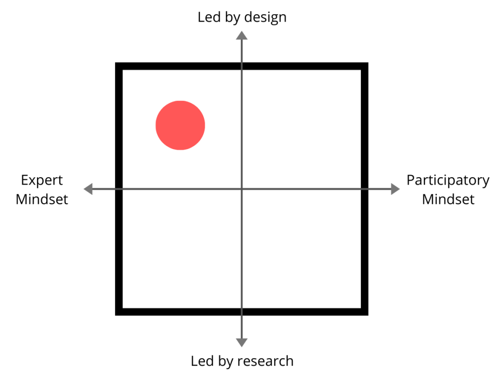
Data collection design (expert mindset and design-led approach):

We intend to use video observations in order to gather information about the locations and their opportunities. We will do desk research in terms of existing papers regarding museums, interactive designs and the story behind the play.
We will then each produce autoethnographic texts in terms of our own experiences with plays, museums and interactive solutions, which we compare and are able to apply to the final design.
Afterwards we intend to present the design idea to potential users, and thereafter look into whether certain elements could be changed/re-designed.
Day 4: Interpreting data – material storytelling
We started the day by going to the location of the old tobacco factory, monastery and historic museum. There we walked around, talked and took notes, in order to explore the area.
We applied the knowledge, that we had just gained about the area, and the knowledge from our interview and walk along with the case owner at the material storytelling workshop.
At the workshop, we used different objects in order to facilitate a conversation about our design ideas, and how different objects were actually symbols of bigger ‘issues’ and/or ideas, which we needed to pay special attention to and/or try to incorporate.
Below is a picture while we are placing objects in the sandbox, and the final sandbox. We took notes during the method and ended up agreeing on four focus points, which we intent to pay special attention to during our work on the final concept:
-
-
- The area (very loud, lots of impressions)
- Different user types – different needs
- Which tools do we want to apply
- What do we want the users to get out of the experience?
-
Day 5: Defining criteria and developing concept ideas
We started defining the core qualities and criteria for our design – based on the data collection we did. We used these criteria in the following idea generation/brainstorm, and ended up with four different concepts, which we presented to the case-partner later that day.
- The solution has to invite to conversations/reflection and thereby creating relevans to them
- The solution should have elements of co-creation/have a social function
- Informative (if it has to function as a program at the same time)
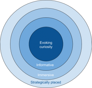
- Should be placed strategically in regards to the environment (road, parking lot, the town square)
Ideas/concepts:
- Augmented reality – in terms of seeing historic representations of how the area used to look like. Different areas – not just C.W. Obels, but maybe how the museum used to look like as well. Possible to see how people were dressed back then, which cars they drove etc.
- “Hidden treasures” via QR-codes or clues, kind of like a scavenger hunt – taking the user around the area, making the user curious and noticing new details of the city/story. Opportunity to “hide ” practical information about the play (the programme) to users who are not engaged in the play (by having the user to activate the information in the garden, where the public cannot access except as an audience to the play).
- Opportunity to create videos for stories in social networks.
-
- Storytelling and being able to create videos. Being able to use different filters provided by the app in order to make ‘old-timey’ videos. https://youtu.be/mHFzkV20lwQ
- Involving characters from the play
-
- Audio book tour – The user has the opportunity to listen to a story about one of the workers. We would implement sounds from the area in the story to make it come alive (on an app perhaps). Use audio in terms of the sound of the characters’ footsteps on the bricks, the sound of the church bell ringing, charleston music in the background etc.
-
- Taking stories from the play outside (narrated by the characters)
- Incorporate senses/activating senses (smell the cigars, feel the materials of the cigars, listen to the audio features, feeling the walls of the building etc.
-
We had a meeting with the case-partner, Martin, and presented each of our ideas and criteria. Martin particulary liked the ideas about using QR codes as a form of scavenger hunt and using information, AR and audio as treasures, which the user is supposed to discover around the city. Therefore, we will further elaborate and work on this idea.
Day 6: How might we-questions and idea generation
We now entered the idea generating phase. We continued were we left off on day 5, so our starting point was the “contract” we made with our case-partner. We brainstormed on different HMW-questions and ended up with this core question:
How might we create a solution which is both appealing to a younger audience but also ensures that the users interact with each other and the environment?
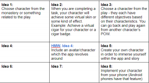
Afterwards we started generating ideas and came up with these seven:
The five best ideas was then treated individually:
We then voted on our three favorite ideas, each vote is marked with an X in the tables, and ended out with these three:
- Find objects with your hands (collect them, feel on the buildings, investigate the area)
- Incorporating senses and different impressions
- Solve the mystery: How did the factory burn down?
- The main narrative for the solution – the ‘player’ is a detective who is trying to figure out who burnt down the tobacco factory.
- Find hidden symbols/artefacts in the area (like in Ribe: https://hexmuseum.dk/hjaelphex/)
- The arsonist left behind some symbols which the player must interpret in order to solve the case
Along these sub-headings you hand-in the deliverables: plan for and results of empirical work, material storytelling/affinity diagram, core design resume, and the how might we questions for your reframed design concepts.
Sketches of the concept:
For the sketches our main goal was to try out different methods in order to narrow down which method would work best for us. Therefore, we did not focus on producing and including recorded audio/speech yet, in order to focus more on the visuals.
First sketchs:
Since we were thinking about including a prototype of the actual app into our final concept video, we wanted to try to create an outline of the app. We used the software Balsamiq to create the prototype below:
Second sketch:
We wanted to use pictures and videos of places of interest and combine them with animated characters and the prototype, in order to convey the usage of the app.
Third sketch:
We wanted to explore the possibility of doing live drawing as a solution. In that way, we are able to creatively convey our concept however we feel like drawing it.
Fourth sketch:
We did a very quick stop motion test, in order to figure out how long making just a short sequence would take. Like with the live drawing, it makes it possible for us to draw whatever we need in order to show off the concept.
Fifth sketch:
We wanted to try to make a mix og live drawing and stop motion in order to creatively show how our app can be used – we thought it would be easy to customize since we are able to draw exactly what we need, and since we don’t have a lot of experience with Adobe Premiere – so we wanted to try out a more low fidelity solution.


