

Members of the Team:
Kamilla Ovedal Nørgaard, Interactive Digital Media
Emma Bollerup Christensen, Interactive Digital Media
Kasper Lindbergh Larsen, Experience Design
Una Súsanna Skaalum, Experience Design
Lærke Gulløv Larsen, Information Studies
Monday 01.11: Intro
Monday we were introduced to the possible cases and divided into groups, as the group’s case-partners were situated outside of Aalborg, with a field day planned, Monday went with planning the interviews in colaboration with the other groups also associated with AAB Silkeborg as their case partner.
Tuesday 02.11: Field Day!
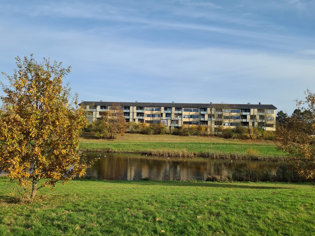
Today we travelled to Silkeborg to meet the case partner and do some field work on Department 18 Resedavej, which would be the case focus.
We were welcomed by Allan Oldenburg, who presentet AAB Silkeborg’s plans to become a sustainable housing sociation, as well as presenting their already initiated steps towards this goal.

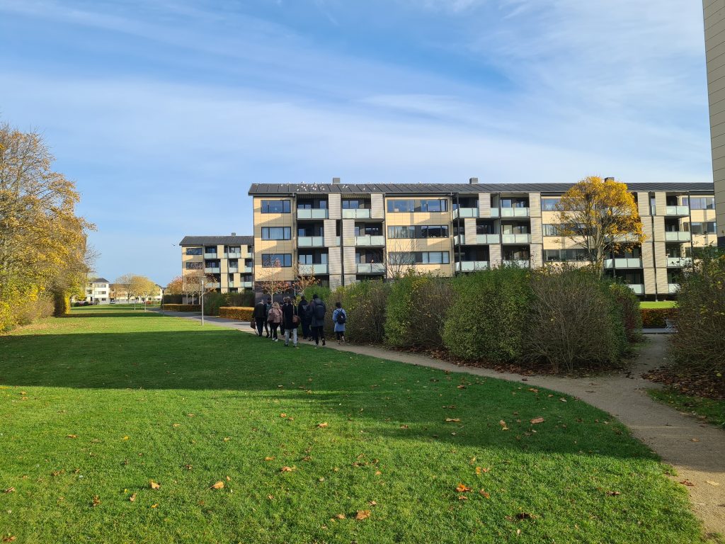
We were then walked over to Resedavej, where 10 residents were waiting for us to conduct interviews at the department common house.
After the interview we looked around the grounds, before returning to Aalborg.
Wednesday 03.11: Research
After meeting with AAB Silkeborg, we started working with the data collected, as well as looking into getting additional data from searching online for housing associations with similar goals and AABSilkeborg’s own available data on their plans. We shared notes and recording with the other groups from the field work, so all groups could have a wider collection of data from Silkeborg.
Thursday 04.11: Data Analysis
We started working with our collected data by listening to the interviews we had not been conducting, and writing down interesting points from the recordings. After this, we started working with our notes using the KJ method and making an Affinity Diagram.
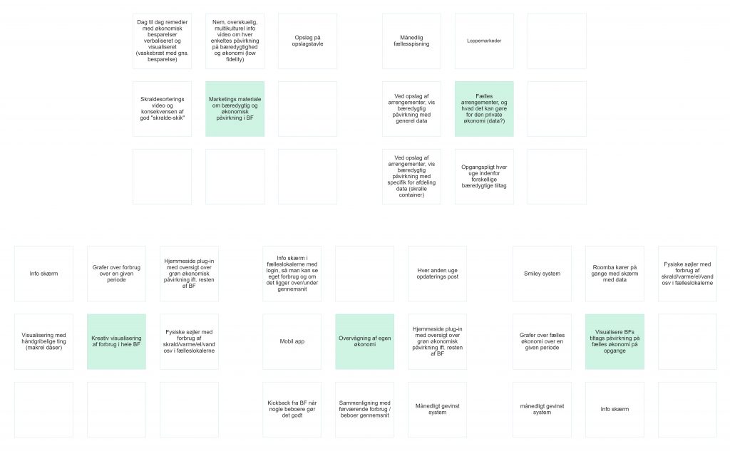
Deliverable: Affinity Diagram
We started by listening to our interviews and then used the KJ method to write down events and statements, that where relevant for the problem.
Then we labeled the statements and divieded them into categories. We made the following categories:

- Vask/vand
- Ansatte
- Bæredygtighed + affald
- Økonomi
- Fællesskab
- Kommunikation mellem boligforening og beboer
- Afdelingsmøder
- Biodiversitet
- Madspild
- Ukategorieseret

Then we connected the labels in the individual categories containing themes from the field work. However after grouping the labels, we found labels across categories, which were related and decided to connect the relvant categories together.

Friday 05.11: Negotiation
Friday we started discussing and identifying what to include in the core design. This led to the finding of some different quality criteria, and then we made several innovation tracks, which we specified into three core designs to present to our case-partners.
In the afternoon we had a meeting with our case-partner via Microsoft Teams, where we negotiated which direction to follow in our concept development, based on the three chosen core designs. We showed them our affinity diagram and innovation tracks to tell them about the key findings from our research.
After the meeting, we narrowed down to one innovation track, which will be the core design we will be working with going forward.
Deliverable: Core Design
By looking at the Affinity Diagram, we found some recurring and connected themes, which we then discussed further, writing down some motivations mentioned by the interviewees. These then helped form some innovation tracks, which went in the directions of these motivations.

Because we ended up with quite a few innovation tracks, we had to exclude some, which we either could not envision how we could solve, or decided were similar to other tracks.

This left us with three final innovation tracks, which we could take with us into the case-partner meeting for discussion.

The Case Partner Meeting
At the case partner meeting they seemed very positive and excited about the ideas and models we presented for them.
They were also positive about what we will identify later and the outcome that might come from this.
In one of the innovation tracks we mentioned the 17 sustainable development goals and the fact that many of the residents do not know what the housing association’s agenda is on achieving some of these, and this our case partner agreed upon. They liked that we have brought transparency into one of our innovation tracks because it relates to one of their values, which is openness.
The topics we mentioned were also something they want and are trying to improve upon but keep getting distracted if any other important thing comes up. They want the residents to benefit from integrating more sustainable solutions without it having much impact on their economy.
Monday 08.11: How Might We
Monday started with a group discussion, where we found out what innovation track to focus on, which starts with “interest for sustainability” and can be seen below:

Based on the chosen innovation track we used the How Might We (HMW) method, where our quality criteria are turned into solutions. The steps we went through here, can be seen below under the deliverable. We narrowed down to three core ideas today, and will decide on a final design idea tomorrow.
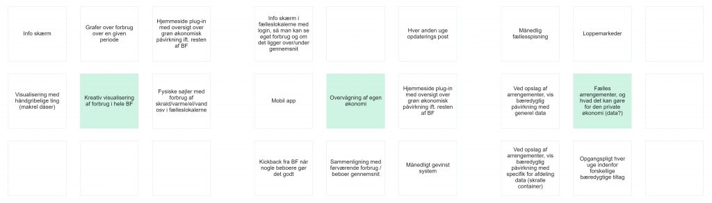
Deliverable: HMW & Ideation framework
By discussing the chosen innovation track we were able to discover 8 possible problem formulations to our quality criteria. These are depicted below:
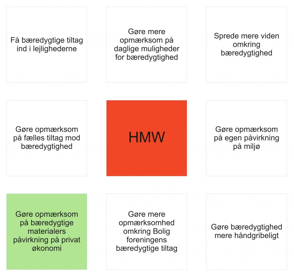
From this we chose the HMW question “Gøre opmærksom på bæredygtige tiltags påvirkning på privat økonomi”, which translates to “Draw attention to sustainable action’s influence on personal finances”. This we then found 8 solution ideas to. We then sorted these ideas and chose 5 to take into the next step. These are colored green in the picture below.

From the 5 chosen ideas, we had another round of idea generation, this time focusing on possible solution paths for the chosen ideas.
After idea generation, we chose the top 3 core ideas, where we could see possibility in the solution ideas we had come up with, and then discussed our own points of interest. From these we discussed the surrounding ideas for each core, to find 3 solutions we saw possible to move on with and make a design for.
Tuesday 09.11: Concepts
Tuesday the group started discussing several concepts based on the solutions to our core ideas, which will be visualized via video sketching in the next two days.
We have found 3 concepts, which will be presented now.

Our first idea for a concept is having different cylinders in the common room, where the average consumption of water, power, heat, and trash for the housing association is being visualized.
The second concept is where the residents can see an overlook over their consumption by having their own login to a website. The website will show if the consumption is over or under the average, but also show the consumption for last month with a piechart or graph.
The third and final concept is again where the residents can see their consumption, but it is shown on a small touch screen placed somewhere hidden in the apartment. The touch screen will show the average consumption at this date and the consumption for the last month. It will also be shown if the consumption is over or under the average.
Wednesday 10.11: Video Sketching
We started visualizing our concepts through making animations with the system Vyond (https://www.vyond.com). Here we created scenarios for each of our three concepts, where we imagined the concepts would be used. These were then animated, using Vyond’s premade assets and animations, to create the following videos:
Deliverable: Initial Concepts
Concept 1 – Consumption Pillars:
Concept 2 – Login to existing website:
Concept 3 – Touch screen placed in the apartment:
Thursday 11.11: Final Concept
Today we started by having a critique session with other groups working on different projects. Here we presented our 3 concept videos, and got some critique from the other groups, as well as from one of the supervisors overseeing the design sprint.
The Critique We Got:
First, people mentioned the animations of the videos. Particularly they mentioned the hand drawing the scenes, as being distracting. They had a hard time following the scenes, and the text, because of these animations.
The text in the videos also was mentioned to be too fast. People had a hard time following the text and the scenario at the same time and felt stressed as the scenes were not long enough for them to follow both before the scene changes.
For the 1st concept, people could see good potential in the comparing element, where the departments were individually displayed. However, this comparison should also be better explained and separated from the comparison of the overall consumption compared to last month.
There were also suggestions from people to combine the cylinder with one of the other concepts, to create a public display of consumption, as well as a private one, where people could see it in their own space. This was suggested to have a website, or even mobile elements in the form of a QR code implemented.
A suggestion for a solution was also made to consider motivation and engaging factors, so instead of focusing on informing, it should be considered to also engage and motivate the residents. A suggestion to this was made to add motivation to the tips already considered in the second concept.
There was a suggestion made for the final presentation, to have a better explanation of the problem scenario and the solution when presenting. It was also suggested that we could make a voiceover, so it is easier to understand what happens and the problem is being described. Each scene with texts will be shown for a longer time, in order to both have time to read the text and see the context.
Deliverable: Final Concept
Based on the critique we were given; the final concept is a combination of the 3 initial concepts. The cylinders in the common room, from the first concept, work as a public display of the department’s utility usage, divided into each department. On the screens under the cylinders, the comparison between former months can be seen too, and the usage is translated into spending.
As well as the cylinders, screens would be implemented in the apartments, from the third initial concept, for the residents to be able to access their own utility consumption in their own private space. From the second initial concept, we implemented the interface with overview, as well as the tips and tricks section, to help residents make more environmental choices.
The final concept can be seen here: